Repaying Guy Kawasaki — Truemors Site Optimization Analysis

I owe Guy Kawasaki a lot even though I’ve never met him. A month ago, I watched a video where he talked about starting a business to make meaning versus making money. That video came at just the right time for me and led me on a new path in my life.

So I’m very pleased to attempt to repay the debt. Tonight on Twitter, someone commented on Guy Kawasaki’s new adventure Truemors and the fact that the site was slow. Guy replied that they were working on it. I sent Guy Kawasaki a quick note that I thought they needed to turn on gzip, but I was reading my YSlow plugin incorrectly.

So instead of trying to provide feedback via Twitter, I thought I’d write up the things that I think will have the greatest impact for Truemors.

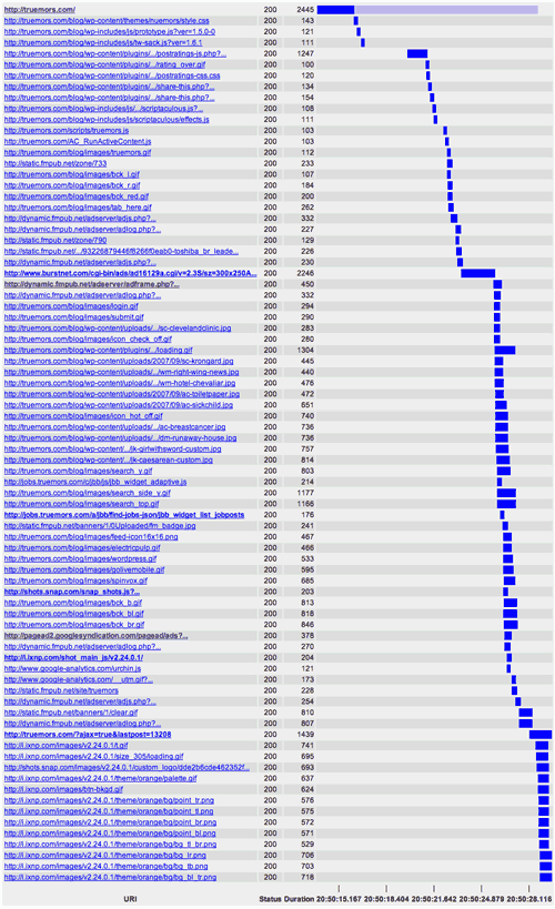
First, let’s look at where the greatest time is spent. Here is a graph showing the download time for Truemors:

truemors-download-small.png
Click image to see full size

The thing to notice about the image is that the html downloads in 2445 milliseconds on my home broadband connection. The total download time is 12,949 milliseconds. This means that the server processing and html download only account for 18% of the total download time.

This is consistent with Yahoo’s 80/20 rule and indicates that the biggest benefit will come from optimizing front-end content.

  • Reduce the Number of HTTP Requests — This appears to be the place with the biggest opportunity for improvement because the Truemors home page makes 79 http requests on an empty cache.

    Keep in mind that browsers will only make two http connections to the same domain at a time. It is because of this two connection limit that most web browsing never reaches the full broadband speeds available.

    To reduce the number of http requests, I would look first at consolidating the javascript files. There are currently 20 javascript files. Javascript files also contain the added determent that the browser will not start transfering any other files until the javascript completes. This effectively reduces the browser to serial downloads for the duration of the javascript downloads. Truemors download graph shows this happening.

    It appears that reducing the number of javascript files will have the largest impact on site speed.

  • Move Javascript to the FooterBrowsers will not render any content below javascript until the javascript has loaded. When a page downloads, one of the things that makes it feel faster is if the page starts rendering first. Because of the number of javascripts in the html head on Truemors, the page remains blank and then snaps into place after a wait. This is a tell-tale sign that progressive rendering is getting blocked by javascript processing.
  • Add expires headers to encourage caching — On the second time the Truemors home page is viewed, it still will download 125k of files and make 64 http requests. Adding expires headers will ensure that files aren’t download unnecessarily and the browser knows that it doesn’t need to check for new files.
  • Test using YSlow and Speed Up Your Site — The YSlow Firefox plugin and the Web Page Analyzer provide free tools for testing the speed.

These are the items that I believe would make the biggest difference. Looking at the Truemors example, I can see one of the disadvantages of my favorite blogging software, WordPress, and its plugin architecture.

All of the plugins are putting their own javascript, images and sometimes even css into the page. These plugins aren’t part of a cohesive vision for the page and add the code to the page where ever they like. It is clear to me that doing things like combining javascript files may require more work because the plugins are responsible for adding them to the page.

I hope Guy Kawasaki and his partners find this information useful. I owe Guy a lot for inspiring me. This post is a small token of my gratitude. Thanks for the video.
Great iPhone Development Resources

I’ve been collecting a series of iPhone development articles that may be of interest.

First, Craig Hockenberry has written some great stuff on Furbo.org as well as articles for A List Apart. It seems like it is likely worth subscribing to his Furbo.org site if you are interested in iPhone development. Some of the articles of interest are:

  • Benchmarking in Your Pants An exhaustive testing that shows javascript executes 80 times slower on an iPhone and why this would be much faster with a native SDK instead of a Safari-based SDK
  • Part I and Part II of his A List Apart series called “Put Your Content in My Pocket.” These articles focus on the basics of building content for iPhones.
  • One Line of Code How to make your site look better on an iPhone with only one line of code.
  • Hacking Quicker How to speed up ssh and other services to make hacking the iPhone faster
  • What the iPhone Specs Don’t Tell You Things like the CPU speed

As you can tell, Craig has a ton of great information. He’s been a one-man iPhone publishing house. Some other good resources are:

Speed of a Site and Usability

Jared Spool and Christine Perfetti discuss a study on how web page speed impacts usability on their latest Usability Tools Podcast. Because this study conflicts with some of the research that I cited during my recent presentation to DevGroup NW on ways to speed up your site, I was anxious to listen to the podcast and review the research.

Basically, the UIE study found that speed did not have the impact on usability that everyone in the human factors field believed. This conflicts with the research cited in Andy King’s Speed Up Your Site book which found that the speed of systems had a high impact on usability.

Here is a quick summary of the findings:

  • The major finding is that the a strong correlation between perceived download time and whether users successfully completed their tasks on a site. In other words, if someone completes their task on a site successfully, they will feel the site was faster than it truly was. If they can’t succeed, they will perceive it as being slower.
  • The secondary finding was that the speed of the page had no correlation with whether or not someone would could complete their task successfully. So making a site faster doesn’t necessarily make it easier to use.
  • In the podcast, Jared described a Gesalt theory from the 40s that time is perceived as going more slowly when your in pain and more quickly when things are pleasurable. Frustrating websites have the same impact on perception. When the website is enjoyable, you perceive it to be faster.

At some point, I’d like to examine the UIE results and try to reconcile them with the other research that has been done in this area, but given the respect I have for Jared Spool’s work, I’m going to accept the UIE study as definitive.

Here are my thoughts on the study and what it means for those looking to speed up their sites:

  • Perception matters more than reality. This was one of my main points of emphasis during the presentation. During the presentation, I focused on how you can build the page to make it seem to load faster. The UIE study says that having a usable site has a big impact on speed perception so looking at the ease of use of the site should be a top priority (if it wasn’t already).
  • The study focuses on web pages, not applications. As far as I can tell from the study and the podcast, the study focused on web pages and sites, not web-based applications. I believe one of the reasons that Yahoo has spent so much time focusing on speed is because of they want people to do work—repetitive tasks—in their applications. I propose that people have less tolerance for delays in their applications than they will for web sites they visit.
  • Other studies still show speed impacting credibility and shopping cart abandonment rates I can’t believe all of the research on these topics is inaccurate. The latest was from Jupiter Research showing 4 second download thresholds for ecommerce sites.
  • The cost-savings for speeding up your site are still worth it. During the podcast, Jared acknowledged that speeding up a site can save money on bandwidth.
  • You shouldn’t have to choose between speed and usability. This is the place where I felt the conclusions of the conclusions of the study were off-base. The study says, “what we’re seeing leads us to wonder if it’s worth the resources to make web pages load like lightning.” And during the podcast, Jared gave the example of companies spending hundreds of thousands of dollars to optimize their websites for speed while ignoring core usability issues.

    Speeding up your site doesn’t require hundreds of thousands of dollars or lots of resources. That was the main point of my presentation last week. Some of the things that speed up sites the most are brain-dead simple (e.g., turn on gzip and shrink page sizes 70 to 80%). This shouldn’t be an either you spend the money optimizing the site or you send the money on usability testing question.

Those organizations that are spending hundreds of thousands of dollars on speeding up their sites are probably looking in the wrong spots for the speed improvements. They are probably spending their time with expensive efforts to increase their server and database speed while ignoring the reality of Yahoo’s 80/20 Rule that the majority of the savings come from frontend design decisions.

So yes, web sites should be designed to be usable and have utility. These efforts are crucial and deserve priority. But very simple changes—mainly gzip and reducing the number of http requests—can have a huge impact on speed. There is no reason to chose between usability and speed.

Speed Matters: Presentation Files and Resources

Speed Matters: Presentation and Resources

We had an exceptional audience tonight at DevGroup NW for my presentation on how to speed up web pages. There were a lot of good questions and an engaged audience. Thank you to everyone who showed up. Here is my presentation from tonight as well as some of the resources I mentioned.

The great irony is that I used so many images in my presentation that I can’t compress the pdf files to the degree that I would like. Sorry for the large file size. If it is any consolation, you’ll likely get to fully use your broadband connection unlike when you download web pages and are limited by current connections to a fraction of your connection speed. :-)

Books on Site Performance

Articles & Resources

Measuring Site Speed

Minimizers and Compressors

Statistics & Studies

Thanks to all of the Flickr users who posted their images with Creative Commons licenses. This presentation wouldn’t have been nearly as interesting without their photographs.

Amazon Redesigns, Removes Trademark Tabs

Amazon unveiled a new design today that removes its trademark tabs in favor of left navigation with flyout submenus. They’ve documented their redesign and the reasons for it.

The amount of content on the site has long outgrown its tab structure, but until now, Amazon has found creative ways to retain the tab structure while growing their store. I know Amazon does extensive usability testing so this new design is a vote of confidence towards the usability of flyout navigation and primary navigation on the left.

You may not see the new design when you visit the site. The FAQs on the new design explain:

Why do I see the new design on my home computer but not at work?
We’re still in our testing phase, and you may not see the new design all the time.

Helvetica Film DVD Pre-Order Available

An entire documentary on typography and the most influential typeface of the last century: Helvetica. I’m in heaven. And now the Helvetica Film DVD is available for pre-order with release scheduled for November 6th.

I missed the documentary when it came to Portland so the DVD will be my first chance to see it. I just need to decide between the basic DVD and the deluxe edition which includes a c-print still from the film and an actual piece of Helvetica metal type. How cool is that?